


Increasing access to public and recreational resources.
Role
UX Designer
+ Researcher
Team
1 Supervisor
1 Project Manager
4 User Researchers
Tools
Figma
Miro
UserTesting.com
Timeline
Jan - Mar 2025
DEFINE
Defining the problem
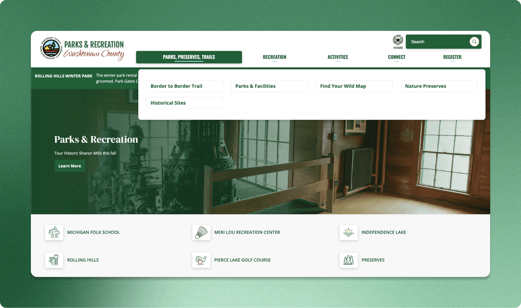
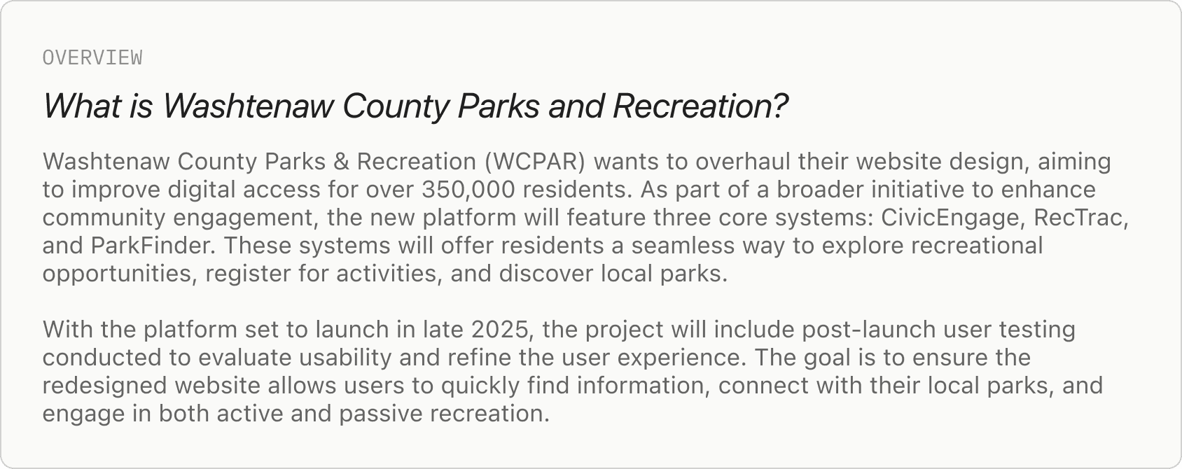
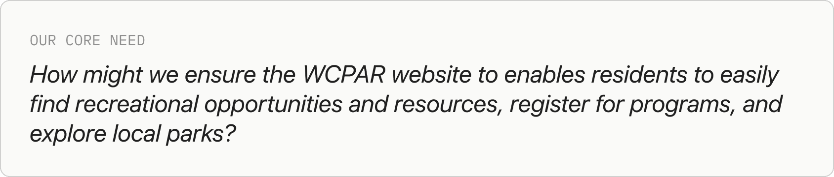
The current Washtenaw County Parks & Recreation (WCPAR) website does not effectively meet the needs of a diverse group of residents, making it difficult for users to easily navigate and find relevant information. As a result, many residents may miss out on opportunities to engage with local parks, recreation programs, and nature areas.
There is a pressing need for an intuitive and user-friendly digital interface that serves all residents, regardless of age, background, or digital literacy. Additionally, integration challenges between the CivicEngage, RecTrac, and ParkFinder platforms create friction in accessing essential services such as event registrations and park exploration.
RESEARCH
Setting up user research
To assess the usability and accessibility of the Washtenaw County Parks & Recreation website, we conducted 12 one-on-one usability interviews with a diverse group of participants. The goal was to understand how effectively users could navigate the website to find information and complete key tasks.
Our participants included:
Residents of Washtenaw County.
Employees of Washtenaw County Parks & Recreation subsidiaries who had not extensively interacted with the website.
Individuals with disabilities to ensure ADA compliance and accessibility considerations.
Age range: 16–60 years old.
Our methodology included:
Semi-structured interviews: Allowed for flexibility in asking follow-up questions based on participant responses.
12 usability tasks: Each participant was asked to complete 12 tasks that mirrored real-world use cases, such as signing up for an event, finding park admission fees, and reserving a pavilion.
Think-aloud protocol: Participants were encouraged to verbalize their thoughts while navigating the website.
Pre-test and post-test questions: Provided insight into users’ prior experiences, expectations, and overall impressions of the website.
Observational data collection: Recorded user actions, points of confusion, and navigation patterns.
User research and usability testing
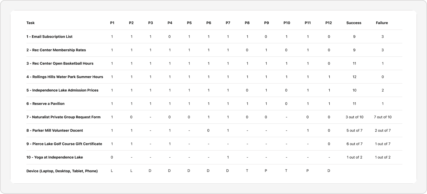
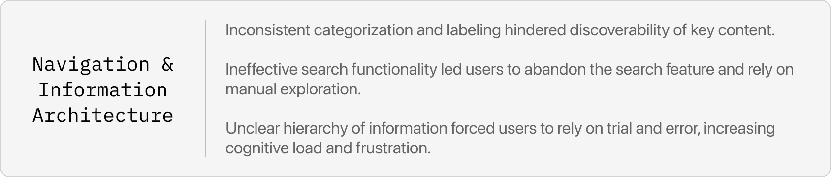
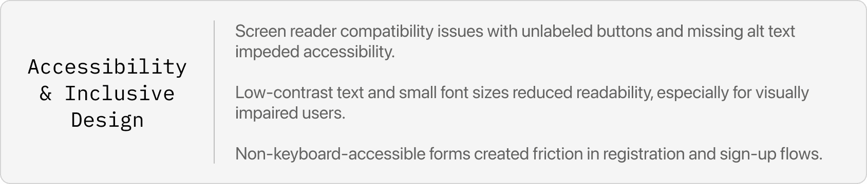
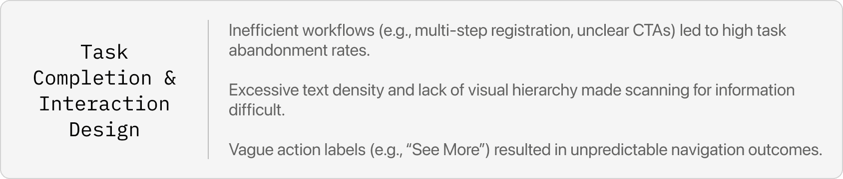
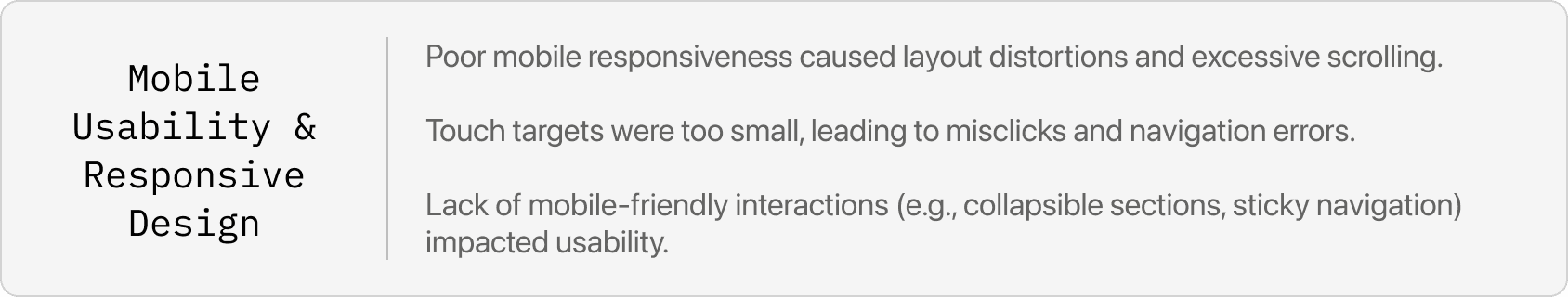
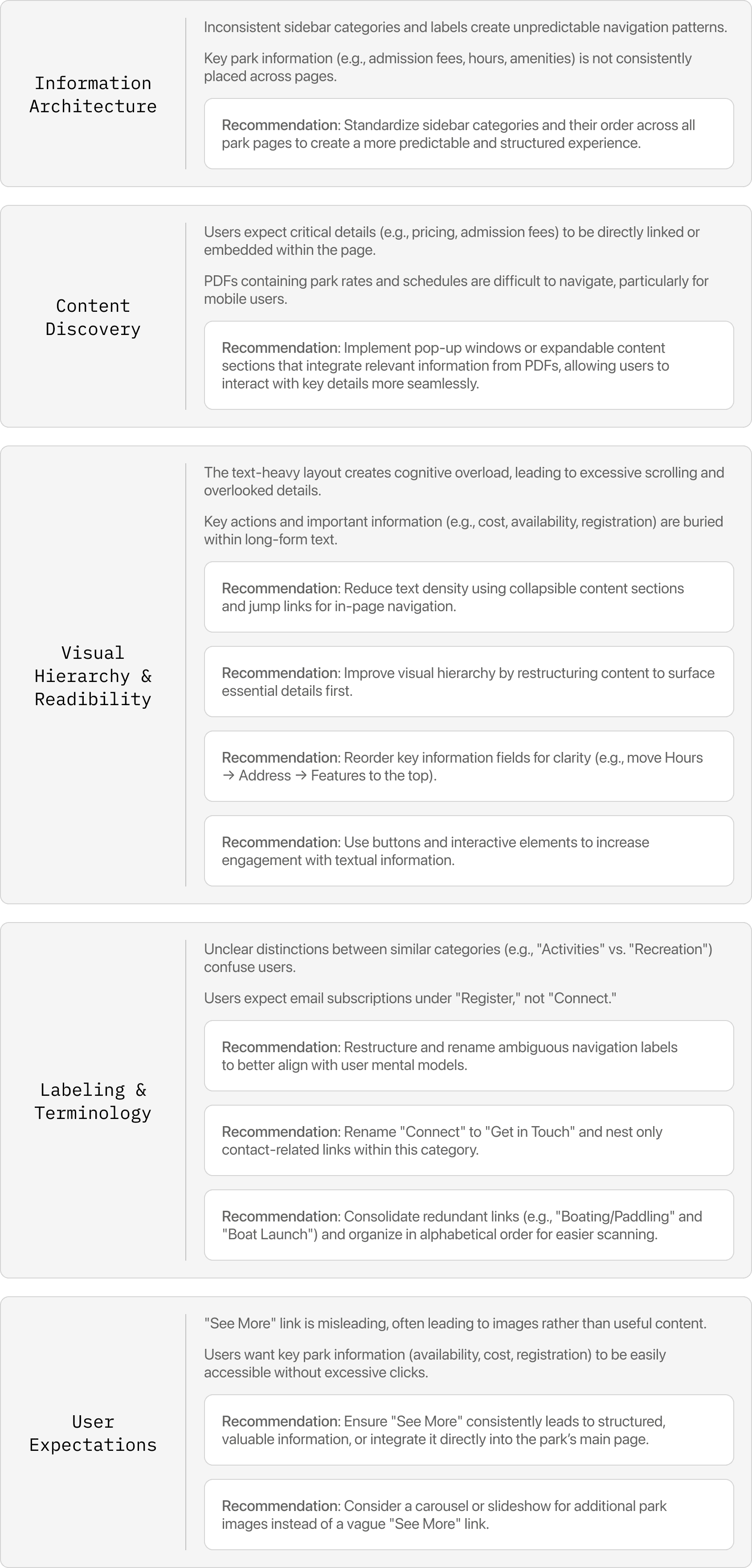
Based on these tests, we categorized them through affinity diagramming and realized the following main pain points:
Affinity mapping

After analyzing these sessions, several patterns and pain points emerged:
SOLUTION
Final report
