🏆 First Place Life-Changing Education — UMSI Exposition 2026
Michigan State University Mobile App
Reimagining library access through a first-of-its-kind Big Ten mobile app.
0-1
UX Design
UX Research

Role
UX Designer
Tools
Figma, Python, Qualtrics, Excel
Timeline
Aug 2025 - May 2026
OVERVIEW
Overview
This project was initiated after the Michigan State University Libraries team observed student challenges accessing the web application from mobile devices. The team conducted research and designed a mobile application, 0-1, enabling students to use library features conveniently and quickly from their mobile devices. The app is set to launch Fall 2026.
At a Glance
14
user interviews
153
contextual inquiries
12%
reduced task completion time
100%
task completion rate
PROBLEM
The Michigan State University Libraries serves a diverse group of patrons.
These patrons include students, faculty, staff, and Lansing community members who rely on its services for research, teaching, and learning. However, many users do not have immediate access to the full range of resources and services the library offers, especially when they are away from a desktop. This can lead to missed updates, challenges locating important information, and difficulties managing checkouts, ultimately limiting users’ ability to fully engage with and benefit from the library’s offerings.
OUR CORE NEED
How might we design a mobile experience that gives MSU library patrons seamless, on-the-go access to their accounts, library resources, and real-time updates, across both iOS and Android?
Project Scope
Our project foundation were three pieces: a project scope document, a project plan, and a broader context report.
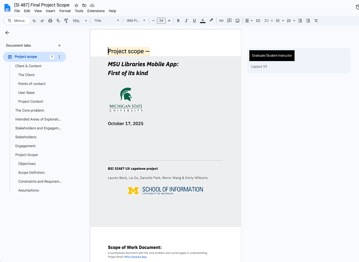
Critically, this allowed us to draw a line between what was in and what was out of scope. Our team ultimately framed our project as a supplement to the physical experience of visiting the libraries, not merely a mobile redesign of the website.
Project Plan
The project was structured across three sequential phases, each with a defined completion milestone:
Research
December 8, 2025
Design
March 31, 2026
Evaluation
April 15, 2026
The research phase would use user interviews, interview coding, affinity mapping, and comparative analysis to surface user needs and pain points before any design decisions were made. The design phase would follow iterative practices, including rapid sketching, low-fidelity wireframing, high-fidelity mockups, and a fully interactive Figma prototype. Evaluation would then use both moderated and unmoderated usability sessions to evaluate the prototype with real users and gather qualitative and quantitative feedback.

RESEARCH
Research Questions
01
What difficulties and successes do users encounter when using the web application on their mobile devices?
After determining key areas of concern from our screening survey, we will develop interview questions and interview guide to efficiently understand how users use the website on mobile and how the proposed mobile app may include features to support the users with these issues.
02
What features are most important and most useful to the multiple user groups that currently use the libraries?
The screening survey will help determine different user groups, with which we will create user personas to help determine the user interview plan.
03
What features would users find useful on a mobile device when engaging with the library system while in person or remotely?
The client is looking for an application that can help with in-person activities (i.e: booking rooms), as well as useful information when physically away from the libraries (i.e: location hours). Do these goals align with users?
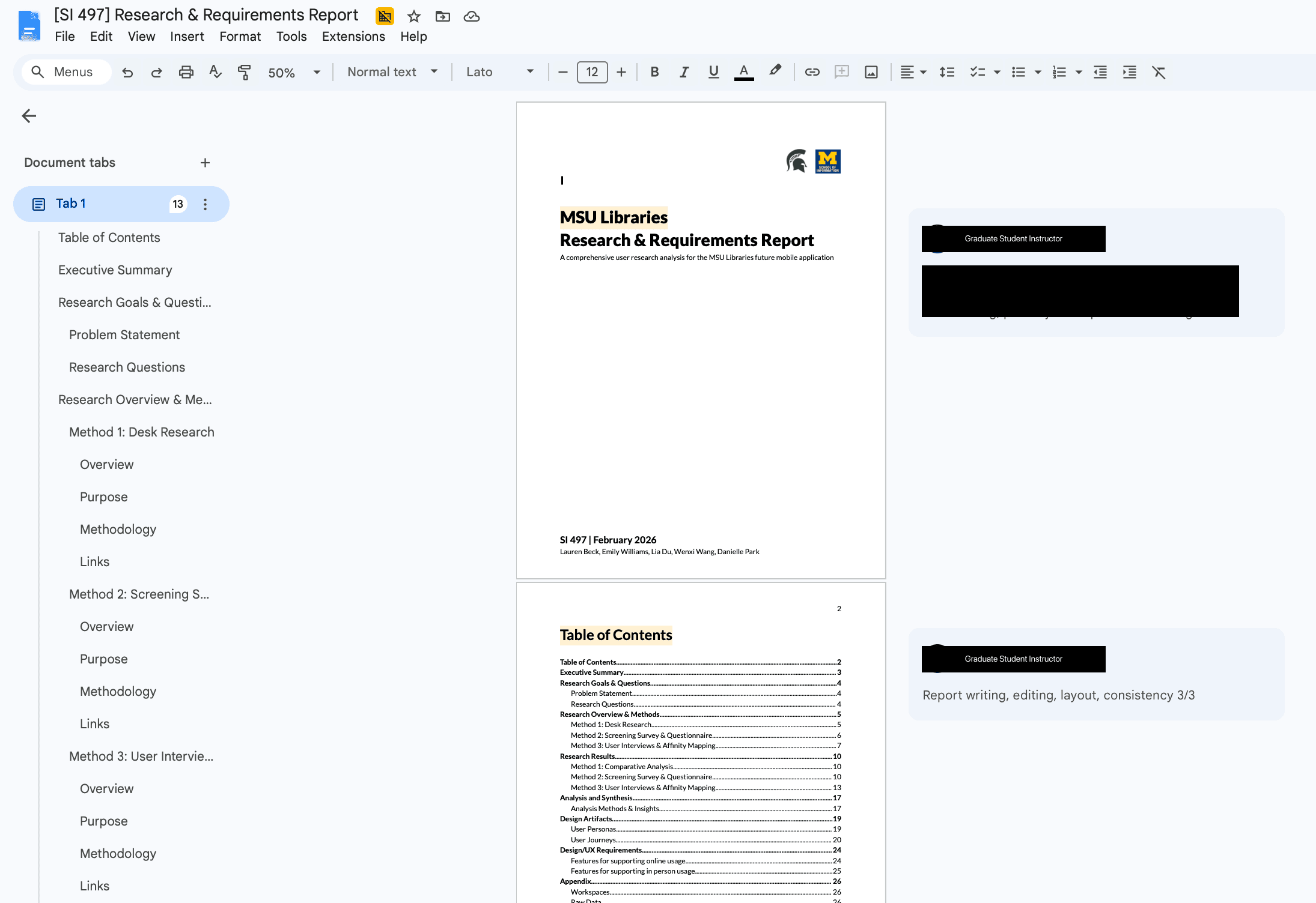
Desk Research
During the first part of the semester, the team reviewed different avenues of desk research to better understand our client and direction for the proposed application. By understanding comparators and current public perceptions of the MSU Libraries, the team is better able to understand the key factors that will make the proposed mobile application stand out within the market – especially since this will be the first app of its kind in the Big Ten Conference.

Screening Survey
Our team deployed a survey to gather a more comprehensive and holistic view of how users currently interact with the MSU Libraries’ physical and digital services .
The survey was created on Qualtrics and was distributed electronically. It included a mix of questions that covered demographic information, frequency and purpose of library use (online and in-person), device preferences for accessing library resources, prior experience with library mobile apps, and perceived value of potential mobile app features.
At a high level, the screening survey was used to establish a baseline understanding of how students and other members of the MSU community currently interact with MSU Libraries, both digitally and in the physical library spaces. The survey allowed the team to identify broad patterns in usage, awareness, and pain points related to the library’s existing tools and services.


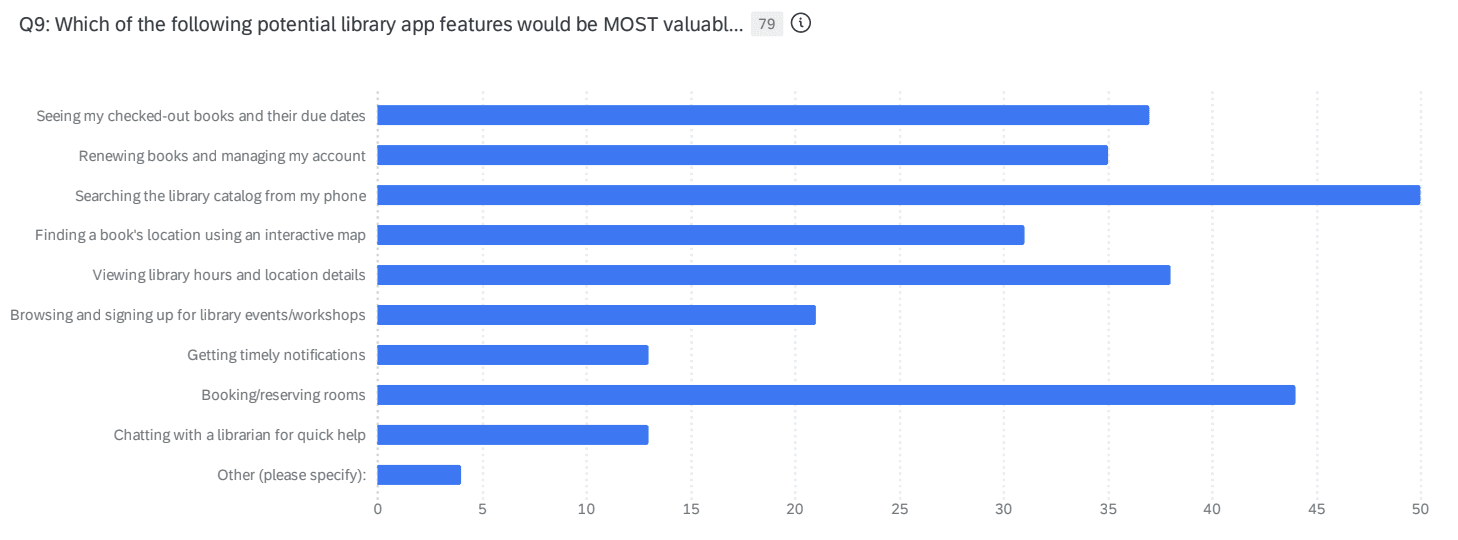
Using the results of the survey, the team created an interview guide with the goal of understanding how users use library services, what obstacles may be in the way of engagement, and what features or interactions would better support a mobile experience.
User Interviews & Affinity Maps
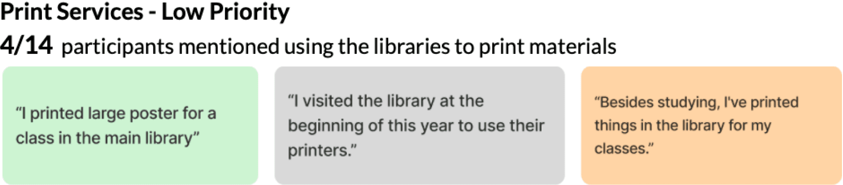
After receiving survey responses, our team conducted 14 semi-structured user interviews to gain insights into how users experience MSU Libraries. Topics included library usage habits, digital navigation experiences, barriers to accessing resources, and expectations for a potential mobile app.

Affinity mapping was then used to synthesize the data gathered.



Personas
Angela
Jordan
Turner


At a high level, the screening survey was used to establish a baseline understanding of how students and other members of the MSU community currently interact with MSU Libraries, both digitally and in the physical library spaces. The survey allowed the team to identify broad patterns in usage, awareness, and pain points related to the library’s existing tools and services.
DESIGN
Design Requirements
Using data gathered from our user research studies, personas, and journey maps, the team proposed general features for the app.
Search Functionality
Similar to searching through library catalogs on the web, users are interested in having similar functionality on a mobile app. Within this feature, users are interested in the ability to use search filters, save items for later, and preview the content within the found item.
5 out of 6 competitors have some kind of search functionality as a major feature of the app.
71% users access online articles and databases. 63% showed interest in searching the library catalog from a phone.
8 out of 14 users use the website to search for reference materials. 2 out of 14 users mentioned wanting a search feature on mobile.
Account Status
Users are interested in the ability to see what the status of their library account is on a mobile application. This would allow for users to know what books, articles, or other items are currently checked out by the user, check on hold times, or renew items.
All 6 competitors have a centralized location for account management.
47% of users borrow physical materials. 47% of users would like a mobile app to view checked-out items and due date. 44% of users would like a mobile app to manage accounts and renew books.
6 out of 14 users mentioned using the libraries to check out books or other resources. 3 out of 14 users would like a mobile app to put holds on items and check account status.
Reserving Physical Spaces
Users are looking to book rooms on the mobile app. Students will need to see which rooms they can book, where those rooms are located, and reserve at a specific time.
Although not a common feature within our comparative analysis, this does exist within 2 competitor applications.
46% of users use the libraries to find a quiet place to study. 56% of users showed interest in booking rooms at the libraries.
5 out of 14 users actively use the website for booking study rooms. 8 out of 14 users would like to see a room booking feature on a mobile app.
Accessing Library Information
Students are interested in knowing more about the libraries in general, like what can be rented, when events are happening, and how to get help.
Although this was not a direct comparison made, 2 out of 6 competitors have some sort of onboarding experience for new users.
48% of users showed interest in viewing library hours and location details.
8 out of 14 users feel they are unaware of library events and services. 6 out of 14 users feel they would benefit from knowing more general library information & resources on a mobile app.
User Flow

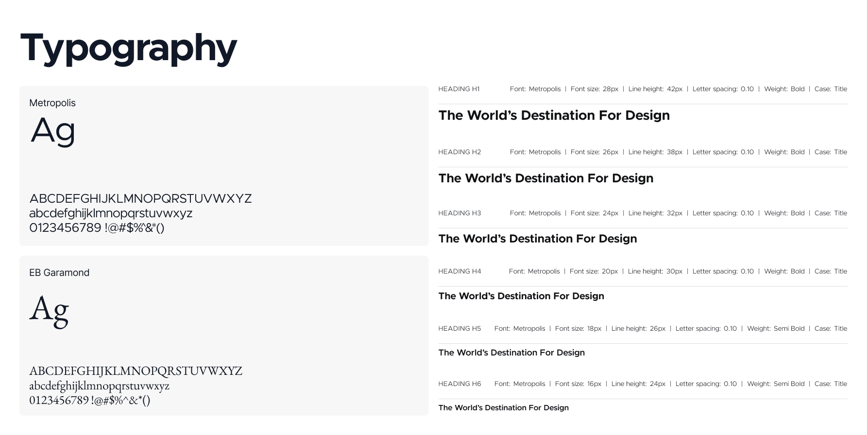
Design System
Typography
Color
Components
Low-fidelity Designs
Home
Catalog
Reserve
Events
Directory
Account


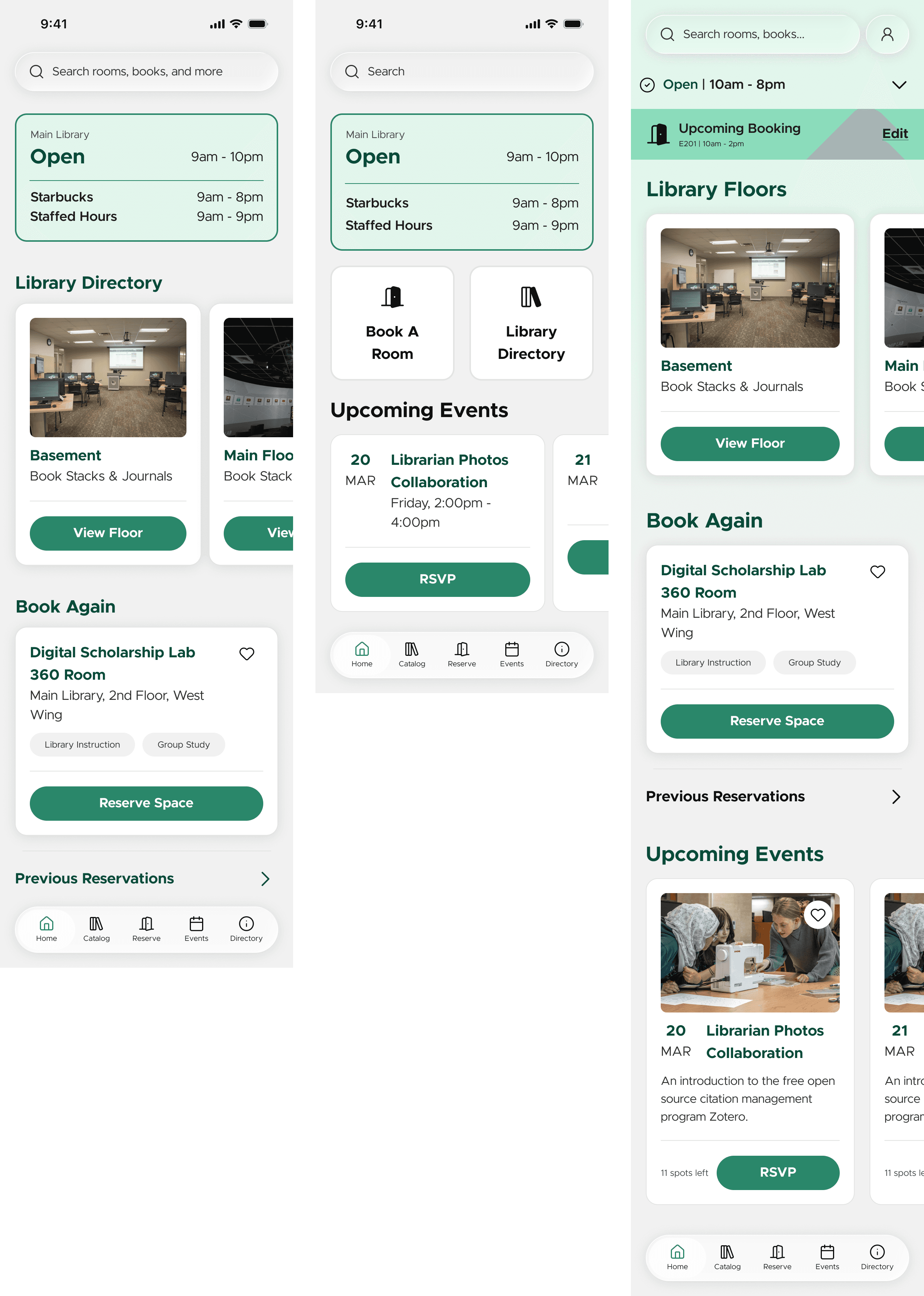
High-fidelity Design - V1
Home
Catalog
Reserve
Events
Directory
Account

EVALUATION
Evaluation Plan
Our team created an evaluation plan consisting of two phases. Plan 1 consisted of an in-person visit to the libraries, where the team set up a table with incentives and gathered survey responses and usability tests. Phase 2 was conducted remotely and allowed the team to gather additional data before revising.
01
Does the prototype support students’ current goals while they are physically in the library?
Are the features useful and aligning with students' in-person, real-time behavior?
02
Are users able to find relevant features in the app that match what they are trying to do?
Is information organized effectively and efficiently?
03
Does the floor-based directory improve students’ understanding of the library layout and available resources?
Does the directory help students navigate the expansive and complex layout of the library?
04
Would students realistically use this app during their time in the library?
Self-explanatory.
Phase 1: Contextual Inquiry & Usability Testing
Phase 1 of evaluation was conducted in person at the MSU Main Library and included both contextual inquiry through survey data collection (n=153) and moderated usability testing (n=5).

A booth was set up at the Main Library! I wasn't able to go as I had class :(
Contextual Inquiry


Additionally, we created a word cloud highlighting the most frequently used terms in open-ended responses. Words such as “easy” and “navigate” appear frequently, which lets us know that users found the app intuitive and straightforward to use. Additionally, “Starbucks” was a highly frequent term in suggested additions, which indicates interest in integrating related information into the app.

Usability Testing
“You are looking to book a room to study with your friends. Book a room on the 2nd floor of the library.”
5/5 participants completed the task.
Common issues
Confusion with dropdown times and checkmark
Unsure where to start when located on the homepage
Design Updates
Rework the reserve flow to make choosing date and time more clear.
Add a quick action on the homepage that directs users to the reserve page
“You are now looking to go to an event at the library. Find an event that you have saved and register for it.”
3/5 participants completed the task
Common issues
Did not complete the user flow
Did not navigate to the saved events
Design Updates
Make sure heart buttons work
Possibly add a description to the different sections
Make the segmented control at the top larger to gather more visual interest
“You are now looking to find what is available on the first floor of the library. Find which wing has study spaces. Then find where study spaces are located on the second floor.”
3/5 participants completed the task
Common issues
Users try to use the map as confirmation of study rooms
Unable to get to second floor without exiting the page
Design Updates
Make sure the conditional variable changes work from all flows
Hide map in a dropdown or make the overlay work better
“You are looking to put a hold on a new book. Find a popular book and describe when you are first able to pick up the book. Then put it on hold.”
3/5 participants completed the task
Common issues
Users try to use the map as confirmation of study rooms
Unable to get to second floor without exiting the page
Design Updates
Make sure the conditional variable changes work from all flows
Hide map in a dropdown or make the overlay work better
“You are curious what books you currently have checked out. Find out what books you have checked out and read out their titles.”
2/5 participants completed the task
Common issues
People think that “My Library” is their current checkouts
Design Updates
Have the “your library” populated with liked books
Add subtitles to the books
High-fidelity Design - V2
Home
Catalog
Reserve
Confirmation
The primary change is from scrollable to static, with a rearranged information architecture that prioritizes the most-used features (room booking, library status, and Starbucks). This reflects both client feedback and findings from the first round of usability testing, where users struggled to navigate the homepage and locate key information.

SOLUTION
End-of-Year Exposition

The UMSI (University of Michigan School of Information) Exposition is an annual end-of-year expo that showcases all of the projects completed by students — whether it be through classes, programs, or independent projects. At the 2026 project exposition, featuring over 180 graduate and undergraduate teams judged by industry experts and UMSI alumni, our team won first place in the Life-Changing Education category, earning a $1,000 prize. Read about it here!
Final Prototype
Our team has handed this project off to our client, and we expect the app to launch by the Fall 2026 semester. Thank you so much to the MSU Libraries team, as well as my capstone team for a year of hard work, ambition, and curiosity. As someone who transferred from Michigan State, I can't help but think of this project as a lighthouse: a guiding light to where my journey began.
Go blue and green forever <3
Thank you for visiting! Feel free to reach out at yutongdu@umich.edu
(Please let me know if you spot any bugs or errors on this page!)